As a game design educator, you can't help but think about all of factors that influence the way people play games. These thoughts lead to realizations. One of these realizations is about how the player's placement at the gaming table influences their play.
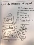
I have seen situations where entire strategies have been ignored by players because of their distance to them on the table. For the past few years, I've been conducting a slow and informal study of this behavior. As a result of this informal study, I have devised what I call the Six Zones of Play. I've already written a somewhat in-depth description of it HERE.
Look. I drew an illustration for you.
However, I have more thoughts on the subject.
I've been thinking about other things that benefit from ergonomic design (because that's really what this is all about): I've already explored game controller, touch screen controls and HUD design in my books Level Up! The Guide to Great Video Game Designand Swipe This! The Guide to Touchscreen Game Design) but in my further research I realized there was a field that could help game designers understand this issue even further: the psychology of dinner settings.
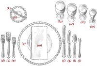
My first stop was that stalwart champion of etiquette: Emily Post, who had this to say on the subject of a "proper" table setting layout:
A proper table setting ala Emily Post
"The most formal table is strictly symmetrical: centerpiece in the exact center, an even number of candlesticks, place settings spaced evenly around the table, silverware lined up and at the same distance from the edge of the table. The space not taken up by place settings is your available real estate."
I have long held the belief that symmetry should be built into the design of the player's tableau. I think that this contributes to the rise in popularity of recessed player boards and gamer trays in the hobby.
Scythe's player boards bring order to what could otherwise be a cluttered player's tableau.
As I went down the rabbit hole, I came across a white paper called "Turning the Tables: The Psychology of Design for High Volume Restaurants" I found the following:
"One prominent theory of environmental psychology is that human behavior in a given setting is largely a result of the interplay of three distinct perceptual factors: pleasure, arousal, and dominance. Various combinations of those perceptions can either attract us to an environment or cause us to avoid it. Mehrabian and Russell describe pleasure as a measure of how much we like an environment and arousal as a measure of how an environment stimulates our perceptions or excites us."
Pleasure. Arousal. Dominance.
I have always been a proponent of what I call a board game's "curb appeal" - that is, how interesting and enticing the play space is for the player. Fortunately, board games are rife with examples:
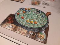
I admit, I fell in love with this game, just by looking at it.
IMHO, Quacks of Quedlinburg's player tableau offers a perfect example of this: pleasure in the form of the delightful art and cutout shapes, arousal with the bright "candy like" colors and shapes of the tokens (made even better with BGG store's resin tokens), and dominance as the tableau grows in complexity, it builds towards the player's success.
Games that focus on these three traits, tend to generate more initial excitement. And when the game doesn't quite have these three traits, players will just find ways to create it for themselves.
This is what I attribute all of custom Terraforming Mars overlays and player boards too. The standard board is prone to getting disorganized (it's not, what I call, cat friendly*) and those recessed parts on those custom boards help make everything stay so darn tidy.
Game designers, take another look at your player's play spaces. Do they provide pleasure, arousal and dominance. Why not?
*The metric of a game being "Cat Friendly" is when your cat jumps up onto the gaming table, how much will the game be disrupted by it?






No comments:
Post a Comment