I DO MY OWN STUNTS Update 13
Let's talk about style.
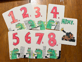
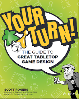
Up until now, I've been showing hand-drawn art for that game that looks similar to the art in my books Level Up! and Your Turn! and my last board game design Oh No! There goes Tokyo!
However, I don't think scanned pen and marker art (as on the prototype's cards) will turn out as well, so I have to make them digitally.
But as I create the digital files, I've been wondering what is the right style for the game?
But as I create the digital files, I've been wondering what is the right style for the game?
I started playing around with alternate styles for the art on the box. This first style uses silhouettes of Hollywood film crew and their equipment. The best thing about this style is that is fast to create and is clear what's going on.
The last style that I've tried so far is a more traditional "meeple in place of a people" that you often see on board game boxes and game company logos.
However, I can't say I'm in love with any of them. Am I overthinking this? What do you think?


No comments:
Post a Comment